May 24, 2024
It's the anniversary of a big shift that could have killed Kosmik

This week was packed again with the release of Kosmik 2.7, finally adding dark mode to the app along with shapes and new drawing tools. Since the beginning of this year, we've added so much to our product!
It now feels like we're reaping the rewards of the switch we made from our native apps to a web codebase. Native apps are great, but when you're just starting out you can't take the risk of cutting yourself off from a big chunk of your potential user base.
A year ago, we had just made the tough choice of moving away from our roots in native apps. Why had we built natively in the first place? The answer is pretty simple. Kosmik is rooted in the idea that the computer can be used as a tool to think, reflect and ideate, not only to produce definitive artefacts. This ideation process is always messy, iterative and fuzzy. If you look around, there aren’t that many devices that were designed with "fuzzy" thinking in mind. This process is usually conducted on paper with a pencil, where one might jump from writing an idea to doodling or designing some kind of mind map.
The only computer that felt like it had been designed for this kind of task is the iPad.
And if you want to build for the iPad, you have to build a native app.
But as we expanded and grew it became clear that the value of Kosmik — the core of our product — was to allow users to pull together various sources both from the web, but also from their file systems and anywhere they may have stored an idea. This required a Kosmik app that was more versatile, lighter and that could run anywhere.
Instead of a sports car, we had to build was a bicycle that could go anywhere, be taken anywhere and be as sturdy as possible while still remaining light.
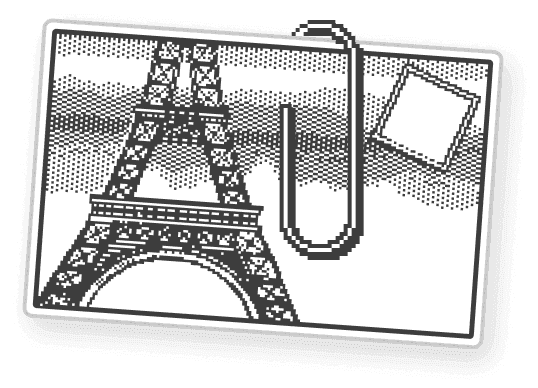
In 1985, Bill Benzon wrote a great piece on how the Macintosh — specifically MacPaint — finally gave us a tool for thinking. He says the information age we’re living in today is an immensely visual one, and he pulls on research that shows drawing networks is a much better way of working out preliminary ideas (i.e. making sense of all of this information and really thinking through it) than trying to put thoughts into a linear outline. Visual networks are also much more scalable and can be built upon without becoming overwhelming.

MacPaint
“If you want to think about how ideas fit together and teach this material to others, then the graph notation is the most useful one… Even if your graph covers half your desk and starts climbing up the wall, you can work with it.
As Kosmik evolved, it became apparent that what we were building was a tool for visual research, rather than just a whiteboard to ideate.
Is there a difference? Yes, and it became apparent to us while we were working on the web browsing workflow.
Just like when you moodboard you have to use a browser to find inspiration and then use your file system to save it and then use yet another app to store, curate and share it — you have to do the same thing when you do research on any topic.
Working on some course material? You have to use Chrome to download the PDF and Acrobat or Preview to read it. Want to take some notes on it? Better open Word or Notion.
The point is, none of those tools are bad and the whole point of the app paradigm is that you get to pick the best tool for the job you have to do. But sometimes and especially when you have to move fluidly between tons of images, files, articles, bookmarks — a unified tool with a few basic programs that works in the same way is the best thing to use.
Our mission at Kosmik is now clear. We’re building a simple platform for people to think visually and navigate their knowledge. Unlike Bill Benzon’s article, your visual networks don’t have to cover half your desk and climb up the wall — they can exist digitally in one infinite space and can be as big or small as you’d like.
Regardless of how big your visual networks are, what’s in them, or what you use them for, we strongly believe the tool that gives you a space to create them has to be simple.
